A spectacular space image can look like a photograph taken through a very large window. Often, it is better understood as a map built from measurements.
A detector records light through selected filters. Scientists and imaging specialists calibrate those observations, remove instrumental effects, align exposures, stretch faint signals and assign visible colours. The finished image may be scientifically faithful without resembling what unaided human eyes would see.
That does not make the image fake. It makes the image an interpretation with a method. The useful question is not “Is this real?” but “What data does this view represent, and what choices turned it into something I can see?”
Begin with the instrument, not the colour
Human vision covers only a narrow part of the electromagnetic spectrum. Telescopes can collect ultraviolet, visible, infrared and other wavelengths. Different wavelengths can reveal different physical features: hot stars, cooler dust, glowing gas or structures hidden behind obscuring material.
NASA explains that each pixel in an astronomical image may represent wavelength, intensity, temperature or another measured quantity. Webb is primarily an infrared observatory, so much of the light it detects is outside the range human eyes can see. Its public images therefore translate invisible wavelengths into visible colours.
Before interpreting a colour, identify the instrument and wavelength range. A blue feature in an infrared composite is not necessarily blue light arriving at your eye. It may indicate the shortest infrared wavelength included in that particular combination.
One filter usually produces a greyscale measurement
Many astronomical cameras make an exposure through a filter that admits a selected band of wavelengths. The result is fundamentally an intensity map: brighter pixels received more signal in that band; darker pixels received less.
To create a colour composite, specialists combine observations made through several filters. ESA/Hubble describes the familiar process of assigning a distinct colour to each greyscale exposure, aligning the layers and merging them. Three layers can be mapped to red, green and blue, but many published images use more than three filters.
This is why two legitimate images of the same object can look different. They may use different instruments, filters, exposure times, colour assignments or scientific goals. Difference is not evidence that one view was fabricated.
Learn the three broad colour relationships
Natural or approximately natural colour
When observations sample visible red, green and blue light and are combined in corresponding channels, the result can approximate how an object might appear to human vision under suitable conditions. Even then, long exposures, contrast adjustments and the limitations of screens mean “natural” should not be read as untouched.
Representative colour
Representative colour maps wavelengths that humans cannot see into colours we can distinguish. A common convention places shorter sampled wavelengths towards blue, intermediate wavelengths towards green and longer wavelengths towards red. NASA’s Webb explainer describes this as a broadly chromatic ordering: the relationship between shorter and longer wavelengths is preserved even though the displayed hues are assigned.
Colour as a scientific key
Sometimes colour is used more like a map legend. It can distinguish specific emission lines, chemical species, temperatures, densities or velocities. In such cases, the correct interpretation depends on the caption or colour key. Guessing from ordinary associations—red means hot, blue means cold—can produce the opposite of the intended reading.
Brightness has also been translated
Raw astronomical files may initially appear almost black because faint information occupies a narrow portion of the detector’s numerical range. NASA’s 2025 Webb explainer says imaging specialists stretch or rescale the data to reveal information buried in darker regions.
A simple linear display can sacrifice faint detail when a bright star dominates the frame. Non-linear stretches can reveal dim structures while keeping bright regions readable. This changes how brightness differences appear on screen, but it need not change the measured positions of objects or invent structures that were not in the data.
The distinction matters: enhancement can make existing information perceptible; fabrication adds information that the observation did not support. Responsible image releases document the processing context and preserve links to the underlying observations.
Calibration is part of the evidence chain
Detectors and optics leave signatures. Individual pixels do not respond identically. Cosmic rays can create bright marks. Optical systems distort geometry. Multiple exposures can be slightly offset. Calibration pipelines correct known instrumental effects before the observations become analysis-ready products.
Those corrections are not cosmetic decoration. They are part of measurement. The Space Telescope Science Institute’s Hubble documentation, for example, describes instrument-specific geometric-distortion reference files used to correct how positions are projected across a detector.
For a general reader, the takeaway is simple: “raw” does not automatically mean more truthful. Raw data can contain detector artefacts that make it less directly representative of the sky. A calibrated product is usually the stronger starting point for interpretation.
Check the scale before judging the scene
A nebula image may feel like a landscape, yet the field can span light-years. A galaxy image may combine a tiny angular patch with distances beyond intuitive comprehension. Without a scale bar, field-of-view statement or catalogue information, visual size is easy to misunderstand.
Also check whether the image is a crop, mosaic or comparison. A mosaic joins multiple pointings. A close crop may remove the broader context. Side-by-side Hubble and Webb views can differ because they sample different wavelengths as well as because their instruments have different resolutions and fields of view.
Orientation is another convention. “Up” in space is not universal. North may be marked, but a release can rotate an image for clarity or composition. Rotation does not alter the relationships within the field, but it can confuse comparisons if the orientation note is ignored.
Use a seven-question image audit
- What object is shown? Look for its catalogue name, location and distance.
- Which observatory and instrument collected the data? Do not assume every famous nebula image came from the same telescope.
- Which wavelengths or filters were used? A compass image or filter key may list them.
- What do the displayed colours mean? Are they approximately natural, wavelength-ordered or keyed to particular physical properties?
- How was brightness displayed? Look for references to stretching, dynamic range or combining short and long exposures.
- What is the scale and orientation? Check the field of view, scale bar, north arrow and whether the picture is a crop or mosaic.
- Where is the original release? An agency or observatory page should provide credits, caption, instrument details and often downloadable versions.
Social-media captions can break the evidence chain
The most serious distortion often happens after the image leaves the observatory. A repost may remove the caption, crop out a scale bar, invent a dramatic claim or describe an artist’s impression as a telescope observation. Compression and aggressive enhancement can further alter subtle details.
Reverse-image search, the object name and the credited agency can usually lead back to the original release. Compare the social post with that page before repeating claims about “true colour”, size, proximity or a newly discovered structure.
Pay attention to labels such as artist’s concept, simulation, composite, annotated image and representative colour. These are not minor disclaimers. They identify different kinds of visual evidence.
Beautiful and analytical are not opposites
A carefully processed telescope image can serve science communication and scientific understanding at once. Colour separation can reveal structures that overlap in a greyscale frame. Contrast can make faint material readable. A public image can invite curiosity while preserving a traceable relationship to measured light.
The honest standard is not “no human choices”. Every useful visualisation contains choices. The standard is whether those choices are methodical, disclosed and appropriate to the question.
When you read the filters, colour key, scale, orientation and credits, a space image becomes more—not less—astonishing. You are seeing how instruments extend perception and how evidence is translated across the boundary of human vision.
Sources and further reading
- NASA: How are Webb’s full-colour images made?
- NASA: From electromagnetic energy to an image
- NASA Hubble: Wavelengths and the invisible universe
- ESA/Hubble: What is image processing?
- Space Telescope Science Institute: Geometric-distortion calibration
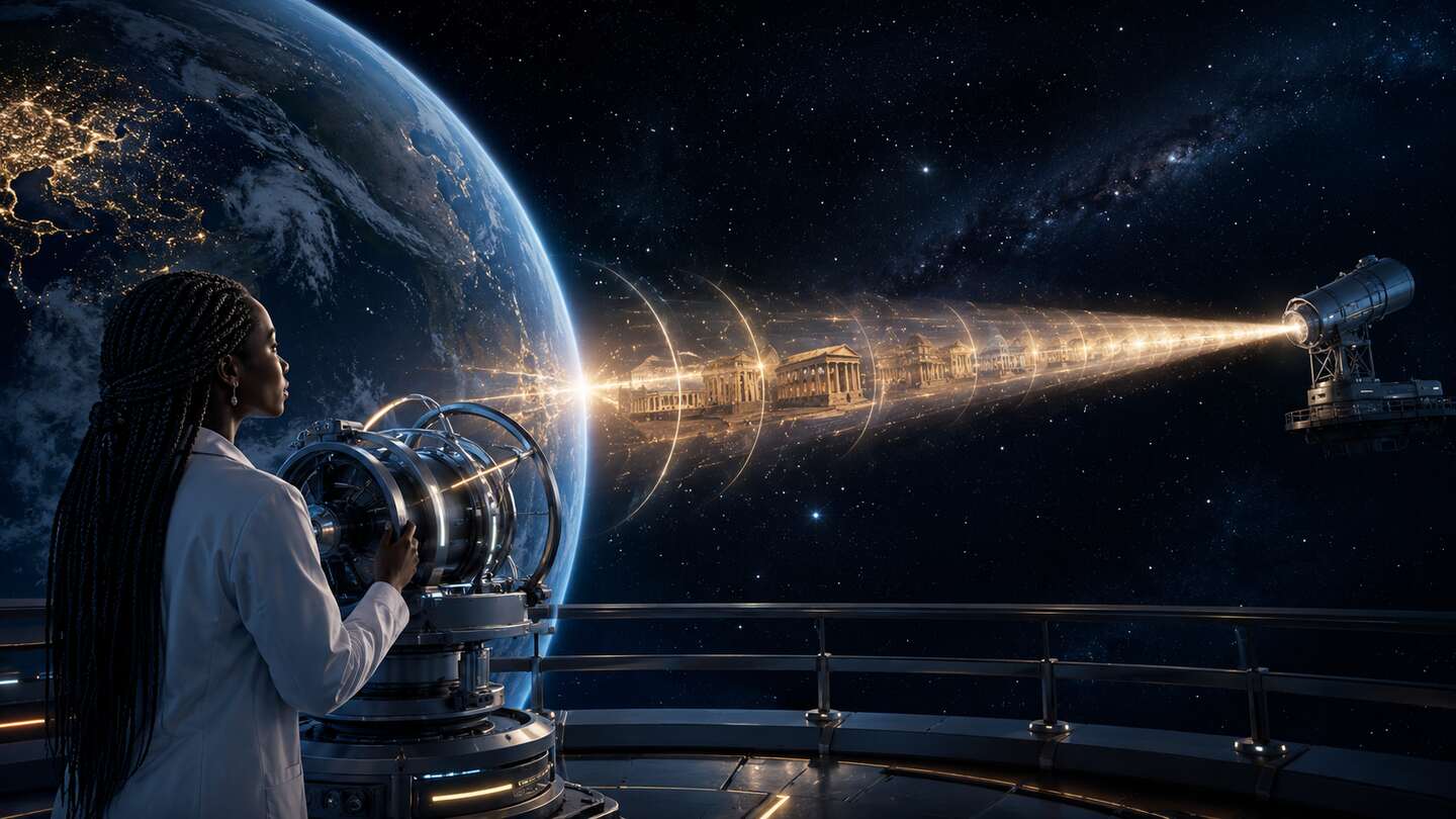
Featured image disclosure: original conceptual AI-generated illustration created for this article. It visualises a generic multi-filter image-processing workflow and is not a documentary telescope observation or a real control room.
Discover more from Marychuks.com AI, Psychology, Business & CreativeVerse
Subscribe to get the latest posts sent to your email.