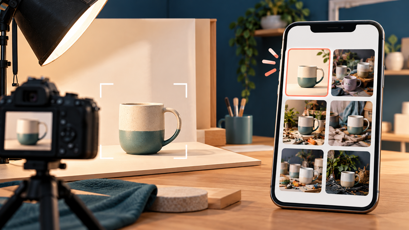
A marketplace listing can have excellent photographs and still fail at the first hurdle: the buyer never understands what the thumbnail shows. On a phone, your carefully staged image may appear as a small square beside several competing listings. If the product disappears into the background, the crop removes an important feature or tiny text carries the meaning, the buyer has to work too hard before they even reach your description.
The answer is not to make every image louder. It is to give the main thumbnail one clear job: help the right buyer recognise the offer quickly and accurately.
A thumbnail is a promise, not a miniature poster
Your listing page can explain materials, dimensions, compatibility, delivery and terms. The thumbnail cannot carry all of that. It should make a simple, truthful promise about what the buyer will find after tapping.
For a physical product, that usually means showing the actual item clearly. For a digital product, it may mean a representative cover or a legible preview of the asset. For a service, it may mean a restrained, relevant visual rather than a generic stock photograph that implies results you have not proved.
This distinction matters commercially. A dramatic image may win an accidental click, but a recognisable image is more likely to attract someone whose expectation matches the offer. The design goal is therefore not “maximum attention”. It is qualified attention.
What established guidance tells us
Some principles are not merely matters of taste. Google Merchant Center’s product data specification says that the main image should accurately display the product and should not contain promotional text, watermarks or borders. Its guidance also warns against submitting placeholders, generic images or artificially enlarged thumbnails. Those rules apply to Google’s own surfaces, but they point to a broader discipline: let the product do the identifying, and reserve sales copy for fields designed to carry text.
Accessibility guidance reaches a similar conclusion from a different direction. The W3C’s images tutorial recommends avoiding images of text when the image is not a logo, and providing a text alternative that fits the image’s purpose and context. Its explanation of WCAG 2.2’s images-of-text criterion notes that real text can be resized and adapted in ways that text baked into an image cannot.
The practical recommendations below are MaryChuks’ editorial interpretation of those principles. They are a design-and-quality workflow, not a claim that one crop or colour scheme guarantees sales.
Run the 120-pixel test
Before publishing, export or screenshot the main image and view it at roughly 120 pixels wide. The exact size will vary by platform and device; 120 pixels is simply a deliberately demanding working test. Do not zoom in. Give yourself three seconds, then answer the following questions.
- Can I name the offer? A stranger should be able to say “ceramic mug”, “desk lamp”, “website template” or “bookkeeping service” without reading the title first.
- Is the important part still inside the crop? Marketplace cards may use square, portrait or landscape ratios. Test the crop that buyers will actually see, not only the full-resolution original.
- Is there one obvious focal subject? Props can establish scale or mood, but they should not compete with the item being sold.
- Does the subject separate from the background? Similar tones, busy patterns and deep shadows can merge at small sizes. Separation can come from light, colour, space or a simpler backdrop.
- Would the image still work without embedded words? If removing the text destroys the meaning, move that information into the title, price, variant selector or description instead.
- Does it represent the correct variant and condition? Colour, quantity, edition, wear and included accessories should not be left to the buyer’s imagination.
- Does the image earn the next tap honestly? Ask whether the listing page fulfils the visual promise. If not, the thumbnail is attracting the wrong expectation.
If you fail two or more checks, do not begin by adding arrows, stickers or more copy. Return to the source photograph or artwork and simplify the composition.
Design for recognition before decoration
A useful thumbnail has a visual hierarchy that survives compression. Start with the largest decision: what must be seen first? Then remove anything that competes with it.
Make the offer occupy useful space
A tiny product surrounded by an impressive room may look beautiful at full size and vague in a grid. Crop closely enough for the product’s form, condition and distinctive features to remain visible, while leaving enough breathing room to avoid accidental clipping.
Use context as evidence
Context should answer a buyer question. A hand can show scale. A laptop screen can show a digital template in use. A labelled second image can explain dimensions or compatibility. If a prop answers no question, consider removing it from the main image and using it later in the gallery.
Keep claims outside the pixels
Badges such as “best”, “limited”, “free delivery” or “premium” can become unreadable clutter and may also conflict with the rules of particular shopping channels. Put verifiable claims in structured listing fields where they can be updated, translated, read by assistive technology and checked against the terms of sale.
Match the method to the type of offer
Physical products
Lead with the actual item in the condition being sold. Make the first frame easy to identify, then use later images for packaging, scale, close-ups, defects, labels and what is included. If the listing is for a set, the main image should not visually imply a different quantity.
Digital products
Do not shrink an entire dashboard, ebook page or spreadsheet into an unreadable speckled rectangle. Choose one representative screen or cover, preserve a recognisable silhouette and explain the contents in the title and description. Use the gallery for detailed previews.
Services and businesses
A generic handshake, rocket or laptop rarely distinguishes one offer from another. Prefer a real work sample you are authorised to show, a clear service outcome shown without exaggeration, or a simple branded visual supported by specific listing copy. For a business sale, the thumbnail should establish the type of business; the evidence belongs in the listing and due-diligence material.
Add accessibility without turning alt text into a caption
Alternative text should communicate what the image contributes in that context. For a product’s main image, that may include the product type, colour, material and relevant view: “Hand-thrown blue stoneware mug with a cream rim, front view.” It does not need to begin with “image of”, and it should not repeat promotional language.
For gallery images, describe the distinct information: the scratch on the left side, the connector ports, the back cover, the size beside a ruler or the contents of the bundle. Decorative images that add no information should be handled according to the platform’s accessibility controls rather than stuffed with keywords.
A ten-minute pre-publication workflow
- Choose the image that identifies the offer most truthfully.
- Create the crop used by the marketplace card.
- View it at roughly 120 pixels wide on a real phone.
- Remove one competing prop, badge or background detail.
- Check that colour, quantity, edition and condition match the listing.
- Ask someone unfamiliar with the offer what they think is being sold.
- Write context-specific alt text.
- Open the live preview and compare the thumbnail with neighbouring cards.
That final comparison matters. A thumbnail is not experienced in isolation; it sits in a visual market. The aim is not to mimic every neighbouring card, but to remain legible and credible beside them.
Judge the click after it happens
Clicks alone cannot tell you whether the image is working. A thumbnail that attracts curiosity but creates confusion can increase visits while weakening enquiries or purchases. Watch the sequence: impressions, listing opens, questions, saves or enquiries, and completed transactions where the platform makes those measures available.
Treat any improvement as evidence about this listing, audience and placement—not a universal law. Test one meaningful change at a time, such as crop, background or focal subject. Keep the title, price and description stable long enough to avoid crediting the wrong element.
If your listing itself still leaves buyers guessing, use the companion guide Your Product Listing Is a Decision Page to check the nine questions your page should answer before publication.
Make the first image earn trust
Your main image does not need to explain everything. It needs to make the offer recognisable, set an honest expectation and invite the right person to inspect the evidence. Design it at full quality, then judge it at the size buyers will actually encounter.
Discover more from Marychuks.com AI, Psychology, Business & CreativeVerse
Subscribe to get the latest posts sent to your email.