Adding several AI providers to a web application can look like obvious progress. More models should mean more choice, more resilience and a better fit for each task. Yet a raw dropdown containing unfamiliar provider and model names often transfers the product team’s complexity directly to the user.
The result is choice without guidance. A user who wants to summarise a document, generate an image or check a contract is suddenly expected to compare context windows, prices, latency, data practices and model versions. Most people did not open the application to become AI procurement specialists.
A trustworthy provider switcher should therefore answer a practical question: which available system is appropriate for this task, under these constraints, and what changes when the user selects it?
Begin with the task, not the vendor
Provider-first design begins with a list of company or model names. Task-first design begins with what the person is trying to accomplish. The difference matters because the same user may need speed for brainstorming, stronger source handling for research, lower cost for bulk processing and stricter data controls for sensitive material.
Ask for the smallest amount of information needed to make a useful recommendation:
- What is the task: write, analyse, extract, code, translate, search or create media?
- Does the input contain personal, confidential or regulated information?
- Is the priority quality, speed, price, privacy or a balanced default?
- Does the result require human review before it can affect another person?
The GOV.UK Design System advises teams to try asking questions that reduce the number of options before using a select component, and says selects should be a last resort in public-facing services because some users find them difficult. That guidance concerns government interfaces rather than AI products specifically, but the design principle transfers well: reduce irrelevant choice before presenting a selector.
Create a capability contract for every option
Every selectable provider or model needs a compact, maintained capability contract. This is not marketing copy. It is the product’s operational record of what the option can do and under which conditions.
- Supported tasks: text, image, audio, document analysis, code or structured output.
- Input limits: file types, file sizes and practical context limits.
- Cost unit: what is metered, how estimates are calculated and where uncertainty remains.
- Performance evidence: results from the application’s own representative tests, not a single public benchmark.
- Data route: which organisation receives the request, where relevant processing information is available and whether retention settings differ.
- Failure behaviour: timeout, rate-limit and fallback rules.
- Version status: the version or alias used, when it was last checked and who owns the review.
NIST’s voluntary AI Risk Management Framework is organised around governing, mapping, measuring and managing risk. Its trustworthiness guidance emphasises ongoing testing and monitoring, context-sensitive risk management and human intervention where a system cannot detect or correct its own errors. A provider registry should reflect those disciplines: map each option to a context, measure it with relevant tests, monitor changes and maintain a controlled response when it fails.
Show meaningful differences at the decision point
A good selector does not display every fact at once. It reveals the differences that could change the decision. For a low-risk writing task, three short labels may be enough: “fastest”, “lowest estimated cost” and “best for long documents”. For a sensitive workflow, the interface should surface data handling, review requirements and any restrictions before the request is submitted.
A useful two-layer pattern is:
- Recommended choice: a plain-language default with a one-sentence reason, such as “Recommended for this 80-page report because it supports long documents and structured citations”.
- Compare alternatives: an expandable panel showing the few attributes that matter for this task, plus a link to fuller information.
Do not use labels such as “best”, “smartest” or “safest” without defining the test and date behind them. Model performance changes, and a general benchmark may not predict performance inside a particular workflow. “Recommended” should be a product decision supported by documented criteria, not an invisible commercial preference.
Make the selector accessible
A visually polished custom dropdown can still be difficult to operate with a keyboard, screen reader, speech input or magnification. W3C guidance says form controls—including dropdown menus—need labels that describe their purpose and are correctly associated with the control. A provider logo alone is not an adequate label.
Use familiar native controls where they meet the need. If the interface uses a custom combobox, follow the appropriate WAI-ARIA pattern, test keyboard behaviour and ensure the visible label matches the accessible name. Keep help text concise and associate it programmatically with the control.
Also test what happens when options are disabled. “Unavailable” is not enough. Explain whether the cause is the selected file type, plan limit, region, temporary outage or organisational policy—and tell the user what they can do next.
Treat privacy as a route, not a badge
A request may pass through the application owner, an orchestration service and a chosen AI provider. The privacy explanation should describe that route instead of displaying a generic shield icon.
Where personal data is processed, the UK Information Commissioner’s Office says privacy information should cover the purpose of processing, retention periods and who receives the data. It should be provided when information is collected, rather than hidden until after submission. The ICO’s broader explanation guidance stresses transparency, accountability, context and reflection on impacts.
Translate those obligations into the interface. Before a sensitive request leaves the browser, show who will process it, the relevant purpose, a route to retention details and whether the provider choice changes any of those facts. If several providers have materially different data terms, make the difference visible before the user chooses—not inside an undifferentiated policy page.
Separate recommendation from commercial influence
A multi-provider application may have volume discounts, partnership arrangements or higher margins on one route. That is normal business architecture. It becomes a trust problem when a commercial preference is presented as a capability judgement.
Keep three records separate:
- the user-facing recommendation criteria;
- the routing and margin logic used by the business; and
- any sponsored placement or preferred-provider agreement.
If sponsorship changes placement, label it. If cost efficiency influences the default, say so in understandable language. A business can optimise its infrastructure without pretending that every optimisation is solely for the user’s benefit.
Design failure before it happens
Provider choice creates new failure modes. One system may be unavailable, reject a file, reach a rate limit or return output that fails validation. Automatic fallback can improve reliability, but it can also silently change cost, capability or data handling.
Define a fallback contract for each task:
- Which failures permit a retry with the same provider?
- Which alternative providers are technically and contractually eligible?
- Must the user approve a change in price or data route?
- How will the interface disclose which system actually produced the result?
- What happens when no safe fallback exists?
For a harmless brainstorming request, silent failover between equivalent routes may be reasonable if the terms allow it. For a workflow containing sensitive personal data or producing consequential advice, a changed data recipient or risk profile may require explicit approval. “Keep the app running” is not the only requirement.
Keep an evidence trail
When a result matters, the application should be able to reconstruct the choice without storing more user content than necessary. Log the task class, provider and model version, routing rule, relevant configuration, timestamp, estimated and actual cost, validation result, fallback events and whether a human approved the output.
Do not call this an audit trail if it is merely a pile of opaque technical logs. The record should answer operational questions: Why was this provider selected? What changed? Who reviewed the result? Could the same route be reproduced? Who can investigate a complaint?
A practical release checklist
- Task fit: Are users choosing by purpose rather than deciphering provider names?
- Evidence: Does every recommendation have dated, representative tests behind it?
- Transparency: Are price, data route and important limitations visible at the right moment?
- Accessibility: Is the control labelled, keyboard-operable and tested with assistive technology?
- Influence: Are commercial preferences separated from capability claims?
- Fallback: Can the system degrade safely without secretly changing important conditions?
- Accountability: Can the team explain which system produced a consequential result and why?
The best multi-AI interface does not celebrate the number of providers it has connected. It makes provider complexity recede until choice becomes useful. Users should retain meaningful control without carrying the full cognitive load of the underlying market.
That is the difference between a dropdown and a product: one exposes options; the other helps a person make a defensible decision.
Sources and further reading
- GOV.UK Design System: Select component
- W3C Web Accessibility Initiative: Labelling controls
- NIST: Artificial Intelligence Risk Management Framework
- NIST AI Resource Center: AI risks and trustworthiness characteristics
- ICO: Transparency in AI and data protection
- ICO and Alan Turing Institute: Principles for explaining AI-assisted decisions
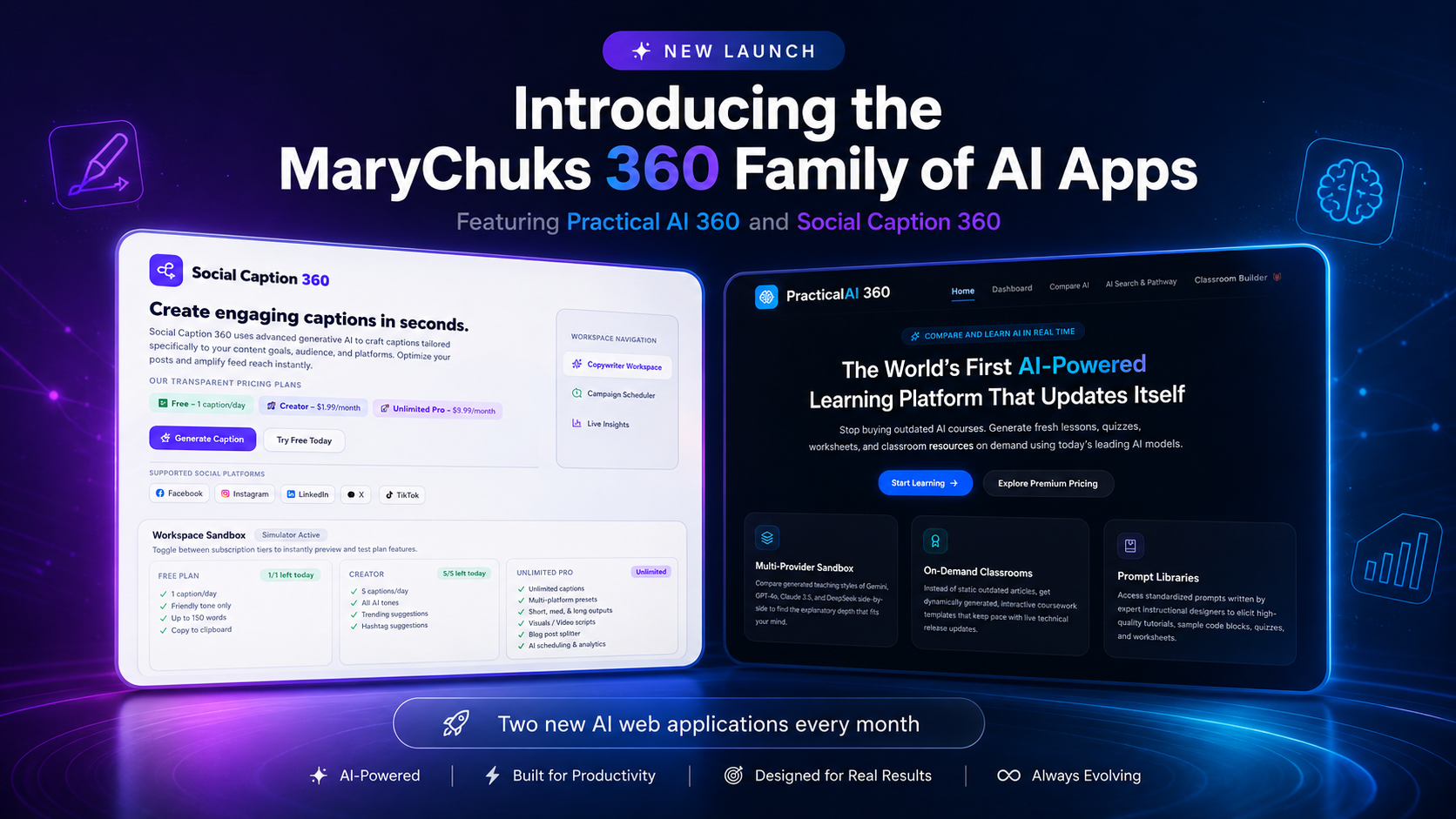
Featured image disclosure: original conceptual AI-generated illustration created for this article. The interface is fictional and is not a real provider comparison, benchmark or product screen.
Discover more from Marychuks.com AI, Psychology, Business & CreativeVerse
Subscribe to get the latest posts sent to your email.